
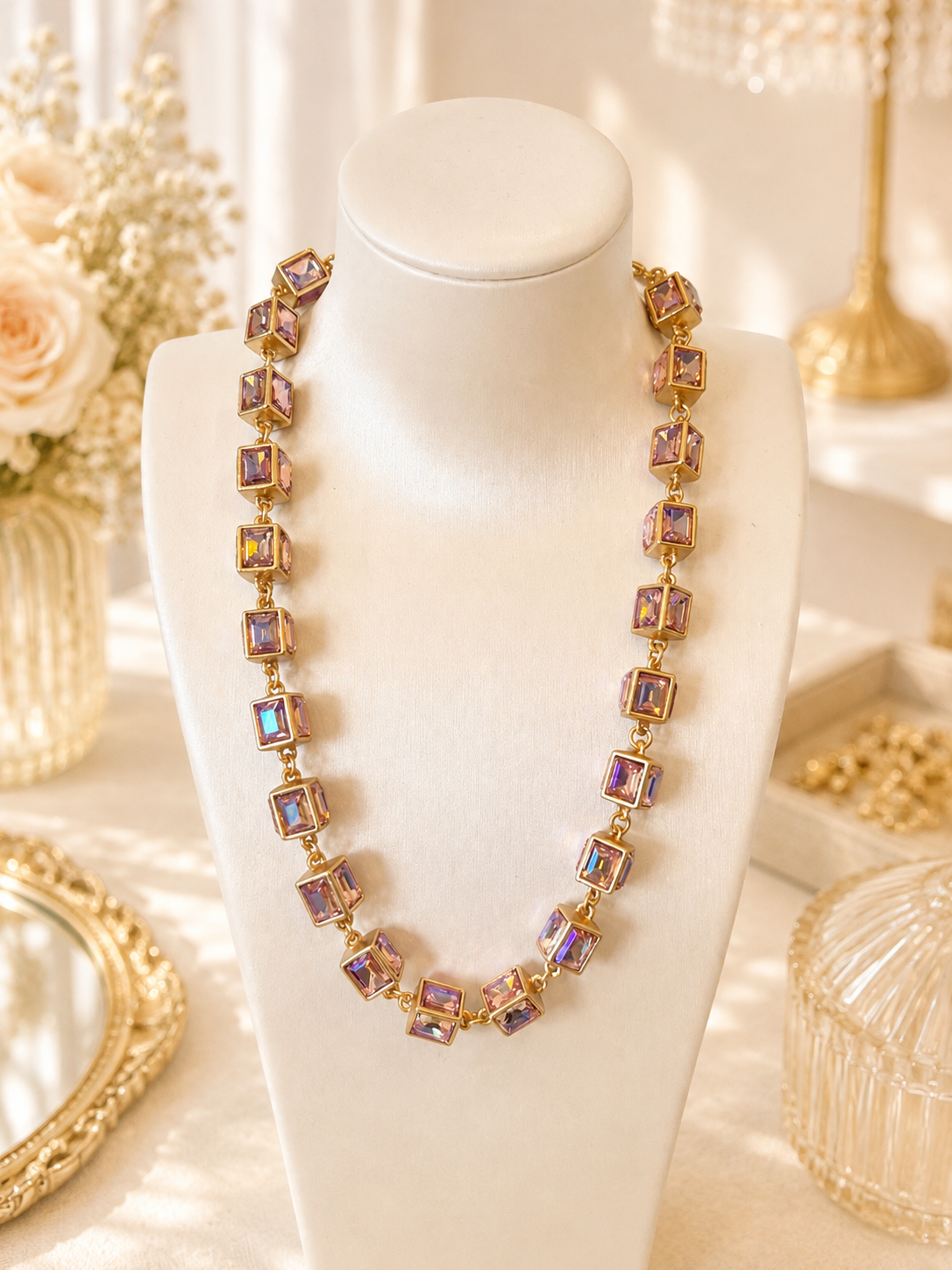
AB describes an effect, not one permanent color
In jewelry listings, AB commonly stands for Aurora Borealis: a rainbow-like surface effect associated with iridescent beads and decorative accents. A piece may look pink in one position and show green, blue, or yellow reflections in another. The useful buying question is therefore not simply “Which photograph is the real color?” It is “Does the range of appearances suit what I want this piece to do?”
That distinction matters when shopping for an exact outfit match. If you need a consistently blue focal point, an effect that sometimes flashes blue is not equivalent to a plainly described blue option. If you welcome shifting color, the same variation can be the reason to choose it. Neither preference is more sophisticated; they are different briefs.
Pictor's explanation of AB rhinestones separates the base color from the added visual effect. Use that distinction as a reading tool, not as evidence that every product labeled AB has the same underlying material or manufacturing process.
Compare the two AB Cube necklace options

The Iridescent AB Cube Crystal-Style Statement Necklace has a linked geometric design and a gold-tone setting. Choose Pink-Purple AB or Watermelon AB on its product page. Each color is sold separately, and the listing notes that its appearance changes with lighting and viewing angle. A photograph showing both options does not mean both are included in one purchase.
For this example, your note might read: “Compare the Pink-Purple AB option through several angles; decide whether I like its changing appearance rather than requiring one fixed shade.” That is a decision about the listing's visual proposition. The phrase crystal-style does not become a gemstone identification, and the initials AB do not establish a particular crystal brand.
Compare the AB effect with the Glass Cube listing
If you like the cube-link shape, also compare the Gold-Tone Glass Rhinestone Cube Link Statement Necklace. Its listing identifies glass accents and metal with a gold-tone finish, with Transparent, Golden Yellow, and Light Green options.
The useful distinction is what each listing tells you. The AB necklace emphasizes an iridescent color effect and names its two options. The Glass Cube necklace expressly states glass as the accent material and names three different options. Do not transfer that material statement to the AB necklace simply because the designs share a cube shape. Likewise, a named color is not a guarantee of an exact screen-to-outfit match.
Separate the base, the reflection, and the surrounding setting
Read a listing in three layers. First, find the selected color name. This is the seller's way of identifying the option you would receive. Second, identify effect words such as AB or iridescent. Third, note the visible framework or setting color. A gold-tone framework surrounding a color-changing accent is not itself evidence that the accent has a gold-colored base.
A supplier can legitimately place color names and effect names in different fields. Fire Mountain Gems' color and effect chart, for example, lists Crystal AB among effects. That naming structure helps explain why “pink” and “AB” can appear together without describing two separate products. It does not identify the components in another retailer's jewelry.
Try this short translation: “Pink option, iridescent effect, gold-tone framework.” That sentence is more useful than calling the entire item pink gold. It keeps three observations separate and makes comparing alternatives easier. If the page only supplies an effect name, leave the underlying color field blank rather than filling it from the brightest reflection.
Watch a color sequence rather than collecting favorite frames
A still photograph captures one arrangement of the object, lighting, and camera. A short continuous view can show how that appearance changes without suggesting that each frame is a different variant. Begin with the whole piece at rest, then follow a modest turn to one side and back. Pay attention to the same accent or panel throughout the sequence.
Do not choose only the frame with your favorite flash. Notice the quieter moments between bright reflections: whether the general impression becomes pale, dark, warm, cool, or mixed. Also distinguish a local flash on one facet from a change across the whole design. A necklace with several angled components may display more than one reflected color at once.
Use the following original viewing log when a listing offers enough images or video. “Not shown” is a valid entry, but the purpose is to summarize the visible sequence, not to manufacture a laboratory color measurement.
| Viewing position | Dominant impression | Secondary flashes | Whole piece or one area? |
|---|---|---|---|
| Resting front view | Write an ordinary color description | Record other visible hues | Name the panel or overall area |
| Turned slightly | Describe what changes | Record newly visible hues | Follow the same component |
| Returned to front | Compare with the first view | Note recurring reflections | Check that the item stayed the same |
A return to the starting position is especially useful. It helps you distinguish an angle-dependent change from a video cut to a different option. This remains a visual comparison, not a promise that your room will reproduce the recorded colors.
Choose for a color match or for changing reflections
For an exact outfit match, start with the selected option's overall appearance across the available images. A blue flash in one photograph does not establish that an AB piece will remain blue as you move. If a fixed hue is essential, ask about that requirement before choosing.
If you want variation, check that you enjoy both the quieter front view and the brighter turned views. Write a decision sentence such as “I want changing reflections within a palette I enjoy,” then note any color impression that would not suit your outfit. This gives you a practical comparison without treating screen images as an exact color guarantee.
Finish with a visual choice, not a materials conclusion
AB is useful vocabulary for anticipating an effect. It is not a shortcut to determining age, origin, substrate, coating thickness, skin compatibility, or wear resistance. Keep those separate from your color decision and from any brand-specific claims you encounter in educational guides.
When the effect fits your outfit, review the selected option and the details actually supplied on its product page. If dimensions or fastening information needed for your purchase are missing, ask before ordering. Our guide to rhinestone, crystal-style, and glass labels explains how appearance words differ from material statements.
Compare the two Cube designs above, or browse the necklace collection. For a boutique assortment, send a wholesale inquiry with the product links, preferred options, quantity range, destination country, and timing.