
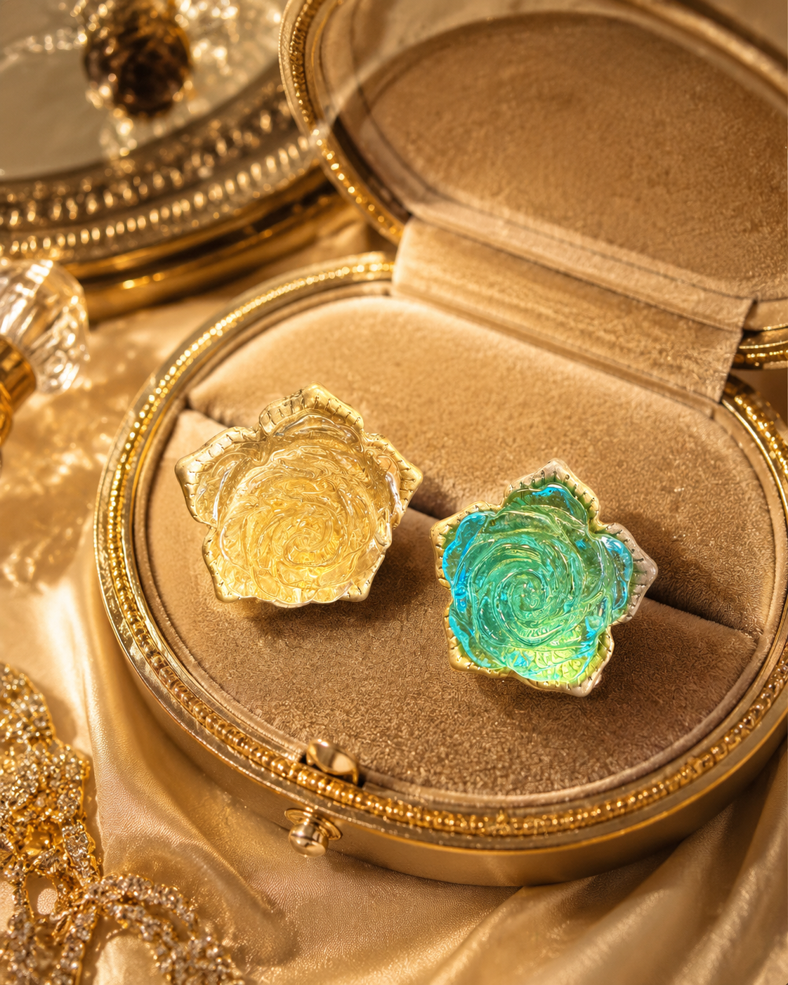
The two labels often describe the same broad category
Costume jewelry and fashion jewelry are commonly overlapping retail terms, not two reliably separate grades of construction. Both can describe decorative accessories made with a wide range of materials and finishes. The label tells you how a seller groups the piece; it does not give you a complete component list or establish how well that particular item is made.
That distinction makes shopping simpler. Instead of trying to decide whether fashion is automatically better than costume, read the exact product description, included quantity, fastening, measurements, and photographs. A carefully described costume piece may be easier to evaluate than an item labeled premium fashion jewelry with no useful specifications.
Design is also broader than imitation. The V&A's history of jewelry discusses contemporary work using non-precious materials such as plastics, paper, and textiles. That context helps explain why a material category alone cannot describe a design's creativity or visual character. It does not identify the composition of any piece you happen to see online.
Use category language as the beginning of your reading, not its conclusion. You can appreciate an expressive silhouette while still wanting a practical explanation of how its parts fit together.
Map the object into four understandable parts
Start with the body: the main frame, band, chain, or shaped structure. Next identify the decorative elements, such as faceted accents, beads, colored surfaces, or a sculptural centerpiece. Then look at the connections between parts. Finally identify the fastening that attaches the piece to the wearer or clothing.
| Part | What to examine | Useful description |
|---|---|---|
| Body | Overall form and visible thickness | Open band, linked chain, broad frame |
| Decoration | Shape, arrangement, and documented composition | Glass rose, pearl-style center, faceted accent |
| Connections | Where separate sections meet | Visible connecting ring or linked drop |
| Fastening | Back or closure of the selected version | Stud, clip-on, clasp, brooch pin |
This map prevents one attractive detail from standing in for the whole product. A necklace can have a clearly described pendant but an unexplained chain length. Earrings can have excellent front photographs but no image of the fastening. A complete evaluation follows all four parts rather than treating the decorative center as the entire object.
Do not turn the map into a home-testing checklist. Photographing a connection or reading a specification is different from bending, scratching, heating, or applying a chemical to determine what it is. The aim is better product comprehension before purchase.
Separate appearance words from component statements
Some product language tells you what a piece looks like. Gold-tone describes a color appearance; pearl-style describes a pearl-like look. Other language makes a more specific component statement, such as a description that explicitly identifies a glass centerpiece. Read those statements at their actual level of detail rather than making them all equally specific.

The product description identifies a rose-shaped glass centerpiece and a gold-tone setting and band. Those are separate statements about separate parts. The glass description does not establish the band's alloy, while gold-tone does not identify the glass. Keeping the words attached to their correct components is more useful than upgrading the whole item into a single material claim.
Likewise, a term describing one accent does not necessarily apply to every small decorative element. Read the scope of the statement. If a description says glass center with crystal-style accents, preserve that distinction in your own notes.
Compare two fictional listings without ranking the labels
Consider Listing A: “Costume earrings; one pair; linked oval drops; stud backs shown; length measured from the top of the stud to the bottom of the drop.” Listing B says: “Luxury fashion earrings; beautiful sparkle; perfect for every occasion,” with one cropped front photograph. Neither example describes an actual RJC product.
Listing A is easier to evaluate because its information is specific. You can identify the unit, locate the attachment, and understand the measurement scope. Listing B may show a beautiful design, but its category and adjectives leave the same practical questions unresolved. That does not prove A has better materials; it means A offers a clearer basis for a decision.
Now imagine both listings add verified component descriptions and full views. You can compare the silhouettes, fastening arrangements, and documented dimensions on their own merits. The category label no longer needs to do work it was never equipped to do.
Use a short comparison note for each candidate: body understood, decoration understood, connections visible, fastening identified, included quantity clear. Mark the missing information once. This gives you a focused follow-up instead of an expanding list of vague doubts about whether the piece is real.
Choose by the task the jewelry needs to perform
Finish by returning to your actual use. If you need earrings for non-pierced ears, the fastening is a decision field, not a minor detail. If you need a necklace to clear a particular neckline, dimensions and arrangement matter. If you are purchasing a gift set, completeness and clearly identified components matter more than which of the two category labels appears in the title.
Do not assume that either label establishes comfort, skin compatibility, water resistance, repairability, or lifespan. Those properties require item-specific information. Nor does costume mean that an item was made for theatrical use only; it is widely used for ordinary decorative jewelry.
Browse the Rustic Jewel Co catalog using the four-part map, then use the Journal for a separate styling question. A good purchase decision can combine visual enjoyment with precise reading. You do not need to dismiss a design because of its category, or pretend the category tells you everything.