
You can choose gold-tone or silver-tone jewelry for your skin tone by comparing the effect you like near your face. Warm, cool, and neutral labels can offer ideas, but they do not assign you a permitted metal color. Start with a pair you enjoy wearing, then compare a similar design in the other finish if you can.
The useful question is specific: do you want a quieter blend, a crisp contrast, or a warmer-looking accent with this outfit? You do not need one answer for your entire jewelry collection.
Keep color preference separate from material requirements
Gold-tone and silver-tone describe appearance. They do not, on their own, identify gold or silver content, a coating, or the components that touch the skin. The finish-label guide explains that buying distinction. A preferred color cannot settle a known material sensitivity or a product's composition.
Swarovski's color guide puts personal preference first and includes both gold finishes with cooler palettes and silver finishes with warmer ones. That is a useful reminder to keep both options open.
Compare designs that ask a fair question
A tiny silver-tone stud beside a broad, ornate gold-tone earring changes several things at once. If you prefer the broad one, you may be choosing its outline or its detail rather than its finish. For a clearer color comparison, use pieces with similar visible area, surface brightness, and accent colors.
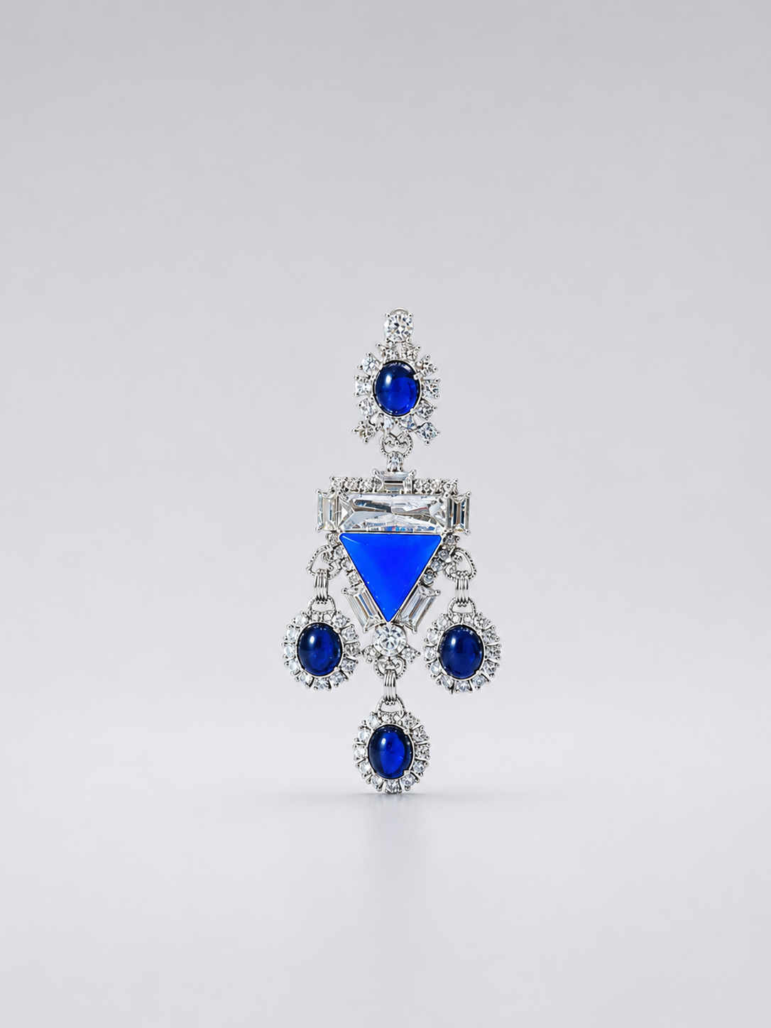
The two blue-accent designs below show how misleading a casual comparison can be. One has a textured gold-tone rounded front; the other uses a silver-tone branching chandelier arrangement. Both include blue, but their shapes and decorative density differ. Their photographs are also taken at different scales. They illustrate finish choices, not proof that one metal color suits you better.


You can still prefer either design. Just name the reason accurately before deciding that you should replace every piece in the other color.
Use the light and clothes you actually wear
Begin in even daylight near a window, away from a strongly colored lamp. Compare both pieces in the same place rather than taking one photograph indoors and another outside. Then look with the top, hair, makeup, and eyewear you plan to wear.
A dark collar, a bright patterned scarf, or a large colored accent can change what catches your attention. If your preference changes with the outfit, that is useful information. It may suggest keeping both finishes rather than finding a single permanent winner.
Describe the result without grading your skin
Try three short descriptions: the finish feels subtle beside this shirt; the border stands out clearly; the colored accent is the first thing I notice. Those statements describe the jewelry arrangement. They do not rank skin tones or treat a visible feature as something that needs fixing.
MONI's comparison guide likewise distinguishes personal styling references from restrictions. If a chart disagrees with a combination you genuinely like, the chart does not need to win.
Keep the decision small enough to use
Choose the finish for the next piece or outfit, not for every purchase you will ever make. A gold-tone earring and a silver-tone ring can remain separate favorites. If you want them in the same look, the mixed-tone styling guide addresses combining them; that is a different task from choosing a finish near your face.
Browse the earring collection with a specific shape and color in mind. Confirm the exact product materials and attachment separately, and keep the finish that gives you the effect you actually wanted.