
A necklace can work with a graphic T-shirt, but the print deserves more thought than the collar alone. A pendant over one letter can interrupt a word; a chain through a portrait can divide the face. If you chose the shirt for its message or image, make the necklace's position respect that reason.
You have three useful options: stay above the print, choose a deliberate overlap with part of the design, or move the jewelry off the chest. None requires the tee to become a plain background.
Find the part of the graphic that must remain clear
Put the shirt on and identify the information you want someone to notice. On a slogan tee, it may be the entire sentence. On a small chest badge, it is the badge outline. On a large illustration, it may be a face or central symbol rather than every printed mark.
Graphic placement is itself a design choice: UNIQLO's custom-print guidance lets designers vary size and position within a boundary. Apply the same attention to the shirt you own. Do not assume the graphic begins the same distance below the collar on every tee.
Try the empty band before the printed area
If there is clear fabric above the design, compare a necklace that sits wholly within that band. Its lowest point needs to stay clear when you sit, not just while you straighten the shirt. A shallow curve may fit where a central pendant would descend into the first line of text.
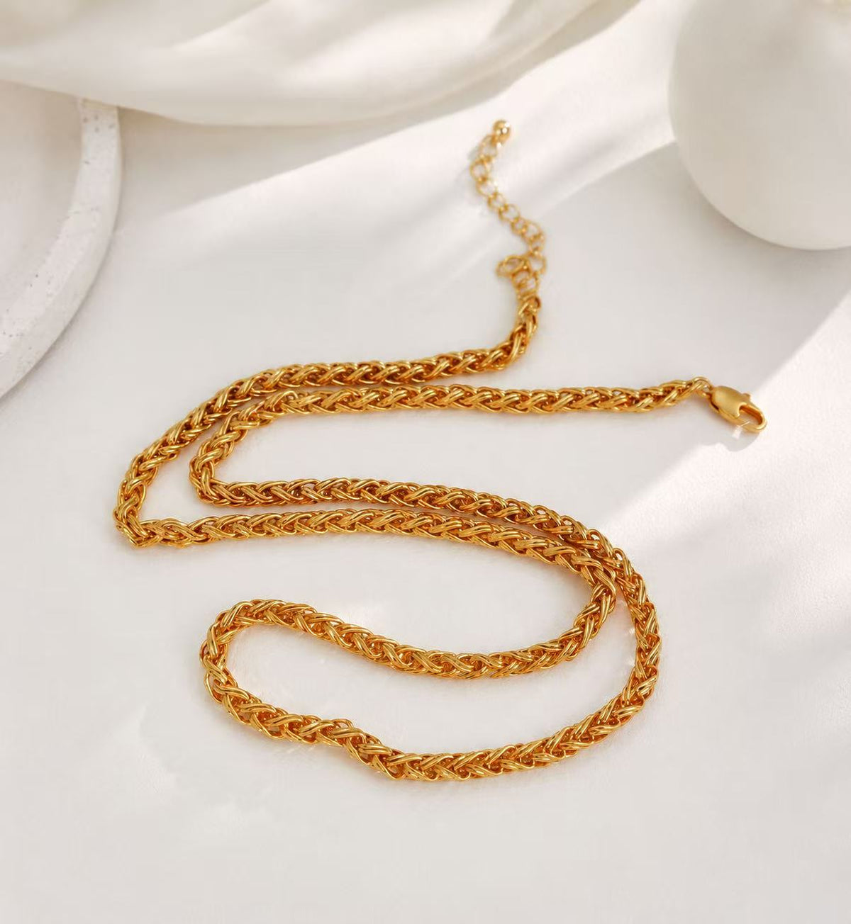
The gold-tone woven chain illustrates a continuous shape without a central hanging motif. Treat it only as an outline reference: a total wearing length and designed adjustment range are not provided in the available product details. Obtain those measurements from the seller before deciding whether this specific chain fits the clear band. Do not estimate its length from the photograph.

Treat three print layouts differently
| Print layout | What to preserve | First arrangement to try |
|---|---|---|
| A wide line of lettering | The sentence as one readable unit | A necklace above the highest letters |
| A small off-center badge | The badge's distinct outline | A centered necklace that does not swing over the badge |
| An oversized illustration | Its principal face, object, or symbol | Earrings or a wrist detail if the image fills the chest |
A deliberate overlap is possible. For example, you might enjoy a pendant appearing within a large abstract print. Name the intended effect first. If the result depends on covering a specific word or face, check that you actually want to change what the shirt communicates.
Watch for almost-matching lines
A chain lying directly on a printed circle can disappear into it. Moving to a noticeably different length can make both lines clearer, while changing only a tiny amount may leave an awkward near-match. Similarly, a small charm hovering against a letter can resemble punctuation you did not intend.
Take one normal-distance picture and read the shirt without zooming. Then remove the necklace and compare. The question is whether the print and jewelry remain understandable together, not which photograph contains more decoration.
Include the tuck and the outer layer
Tucking a tee can move and fold the lower part of its design. An open jacket can hide its outer edges. Decide on those clothing choices before making the final necklace adjustment, or you may solve a layout that disappears once dressed.
Use the neckline guide for the collar boundary, then apply the separate print check here. Browse necklaces with a picture of your actual tee. When the image occupies all the useful space, leave it intact and let another part of the outfit carry the jewelry.