
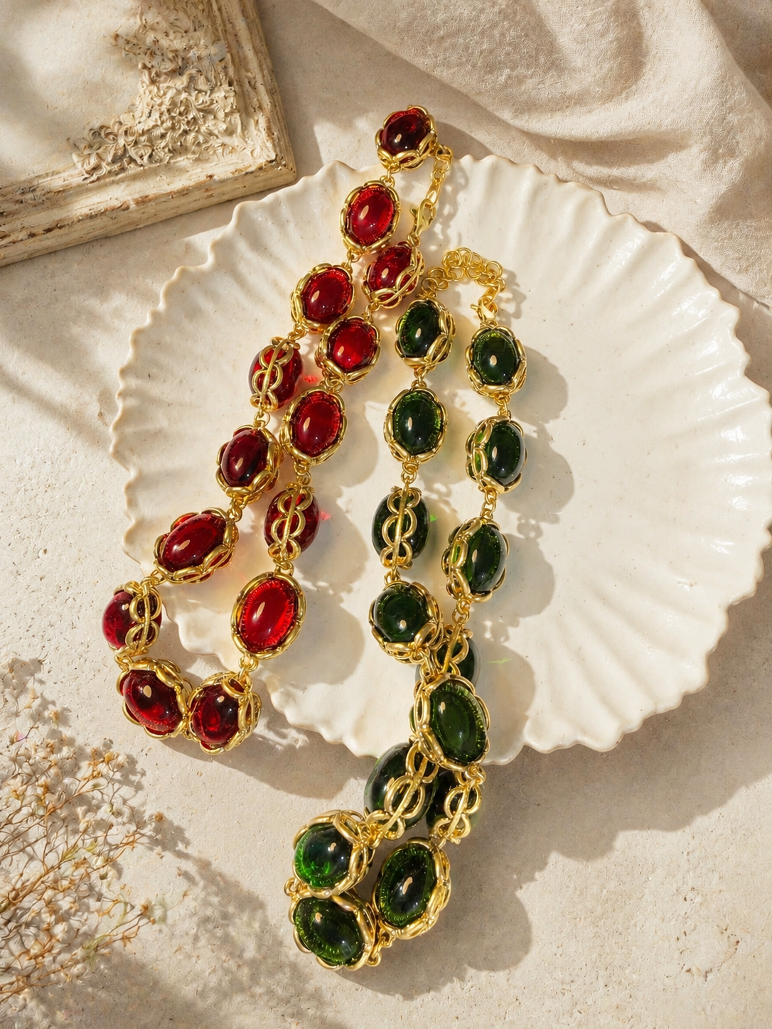
For a green dress, start with the shade you own rather than a universal gold-versus-silver rule. Pale sage, bright emerald, muted olive, and deep forest green create different backgrounds. Gold-tone jewelry can add warmth, silver-tone jewelry can add a cooler edge, and pale accents can make either combination feel lighter.
Separate color from fabric
Lay the dress near a window, then look at it under the light where you will get ready. Notice whether its surface is matte, shiny, or textured. A reflective green dress already changes as you move; jewelry that looked subdued in a flat photograph may become much more noticeable beside it.
Do not treat “emerald” as a material description when it appears in a color name. A green stone-style accent and an emerald gemstone are not interchangeable product claims.
Choose a contrast rather than chasing a match
If the dress is saturated, compare a metal-only piece with a pale-accent piece before trying another strong color. If the dress is muted, a richer accent can be a deliberate contrast. These are starting points for your eye, not restrictions on what someone with a particular complexion can wear.
Matching green to green is possible, but it is also where screens can mislead. Compare actual items if you can. If you cannot, choose a visible difference—such as a brighter green against a dark dress—rather than buying on the assumption that two greens will be identical.

Read multicolor product photographs carefully
The pictured necklace listing displays red and green options together. Use the image to compare their shapes, then select the intended option on the product page. A photograph showing two necklaces does not by itself tell you the selling unit.
For a green dress, the green option suggests a tonal direction; the red option suggests a stronger contrast. Neither is a required seasonal pairing, and neither photograph tells you where the necklace will sit on your body. Check the actual length before deciding.
Keep one decision at a time
- Put on the dress with the shoes you plan to wear.
- Try a metal-tone option without a necklace or other new accessory.
- Compare a pale or colored accent in the same position.
- Add a second piece only if it contributes something you still want.
This sequence helps you distinguish a color problem from a scale problem. If an earring feels too busy, a simpler outline in the same color may solve it; changing the entire palette may be unnecessary.
Check the product information that photographs cannot supply
Use the jewelry photo color checklist when different images show different shades. For a substantial necklace, also establish length and fastening before ordering. Do not infer comfort or material quality from saturated color.
Explore the necklace collection with a clear brief: a warm outline, a cool outline, a pale contrast, or an intentionally different green. That makes the search more precise without pretending there is only one correct match.